Minimalism as a Selling Point: The New Shopify Store from nordesign.
Minimalist aesthetics meet well-thought-out sales strategy.
View websiteInitial Situation:
nordesignsells interior design products whose strongest selling point is their design. You can find an organizer anywhere, but one you’d actually want to display—not so much. That’s exactly how the shop is judged: If you’re charging 49 euros for a metal object, its product page can’t look like a standard theme with a swapped-out accent color. At the same time, the company had long since outgrown the scope of a minimalist brand store. Multi-piece sets, Europe-wide shipping, and a growing retail business with listings at dm, Budni, EDEKA, and Müller. The challenge, therefore, was to combine two elements that typically clash: a calm, luxurious visual language and the sales mechanics of a growing D2C store.
Our solution:
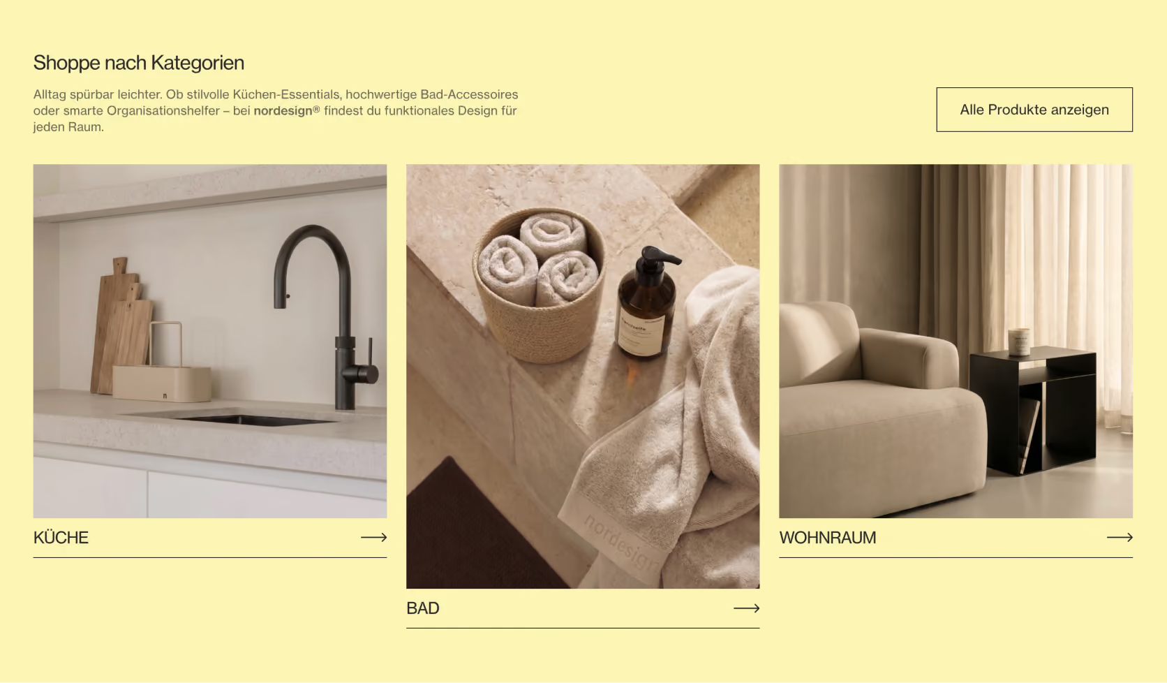
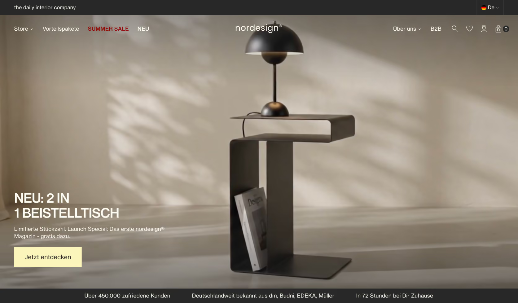
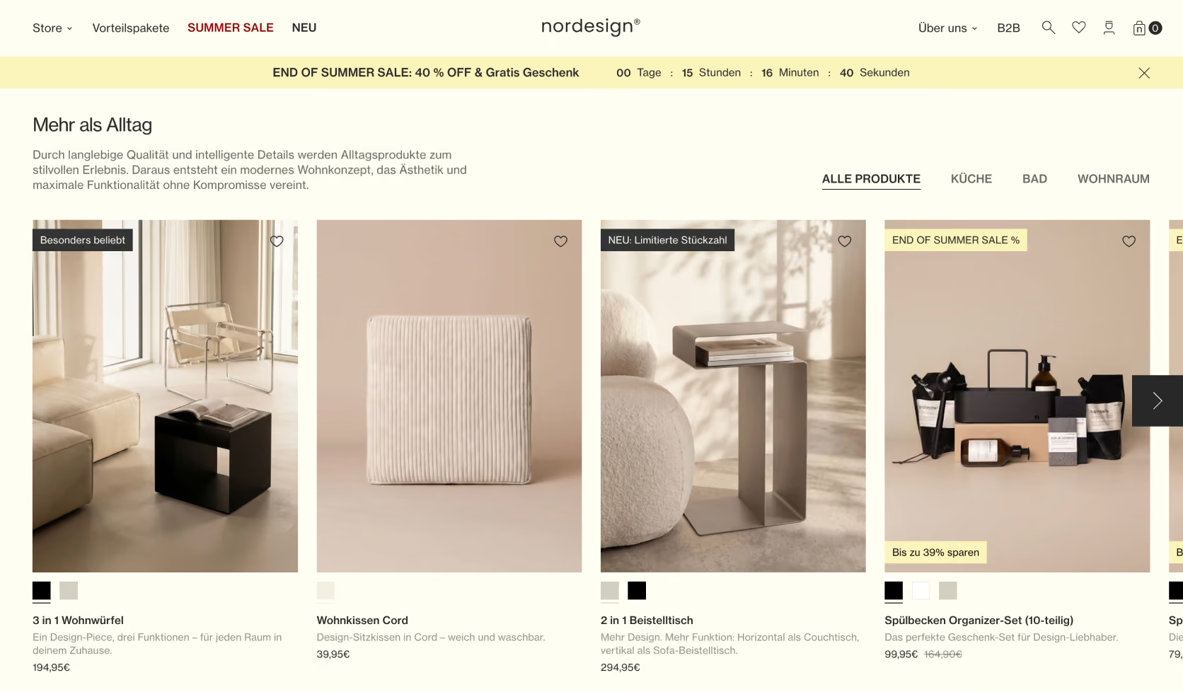
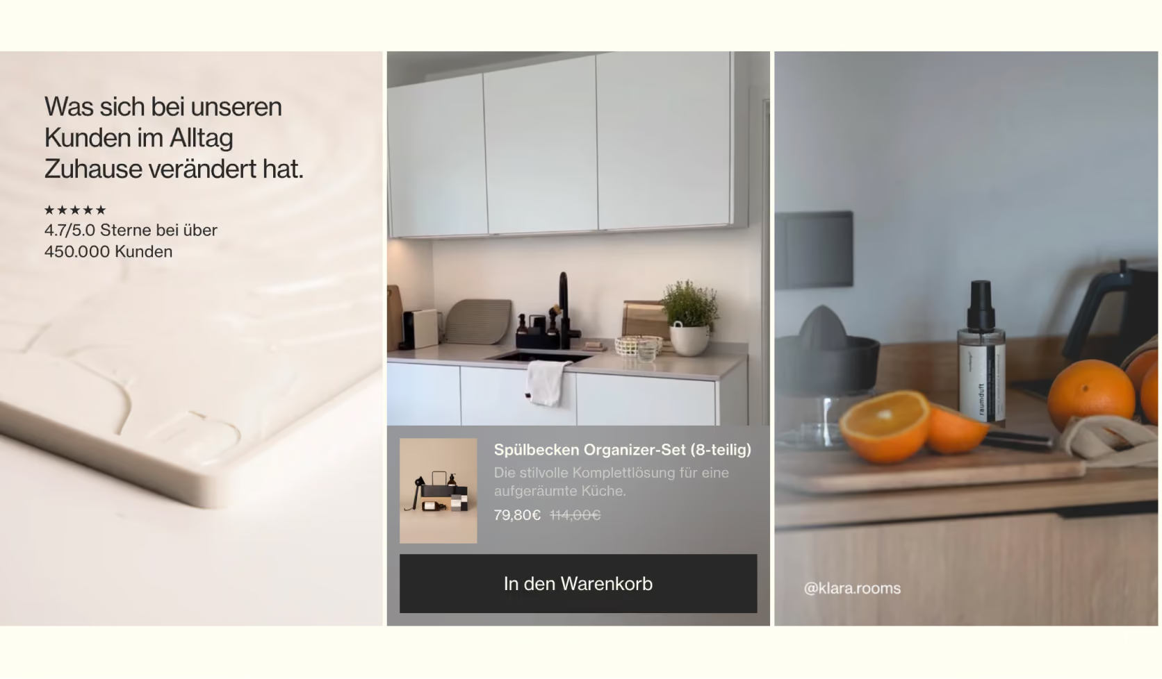
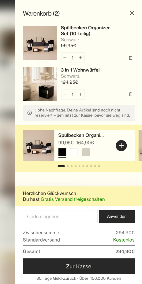
Wedeveloped a completely custom theme based on a design system featuring black, white, and greige—colors that complement the product line’s color palette rather than overpowering it. We incorporated plenty of white space and kept elements to a minimum, just like the products themselves. In addition, there are various country-specific storefronts tailored to local conditions, bundle upsells, a B2B section with net prices within the same store, and custom-designed Judge.me reviews. Because everything is organized by section, new campaigns and landing pages can be created without any development effort.
Success & Highlight:
Theconversion rate rose from an average of 2.5% to an average of 3%—a 20% increase—without the store becoming more cluttered. A store that doesn’t feel like Shopify, but rather like the brand itself, while still fully incorporating the sales logic.
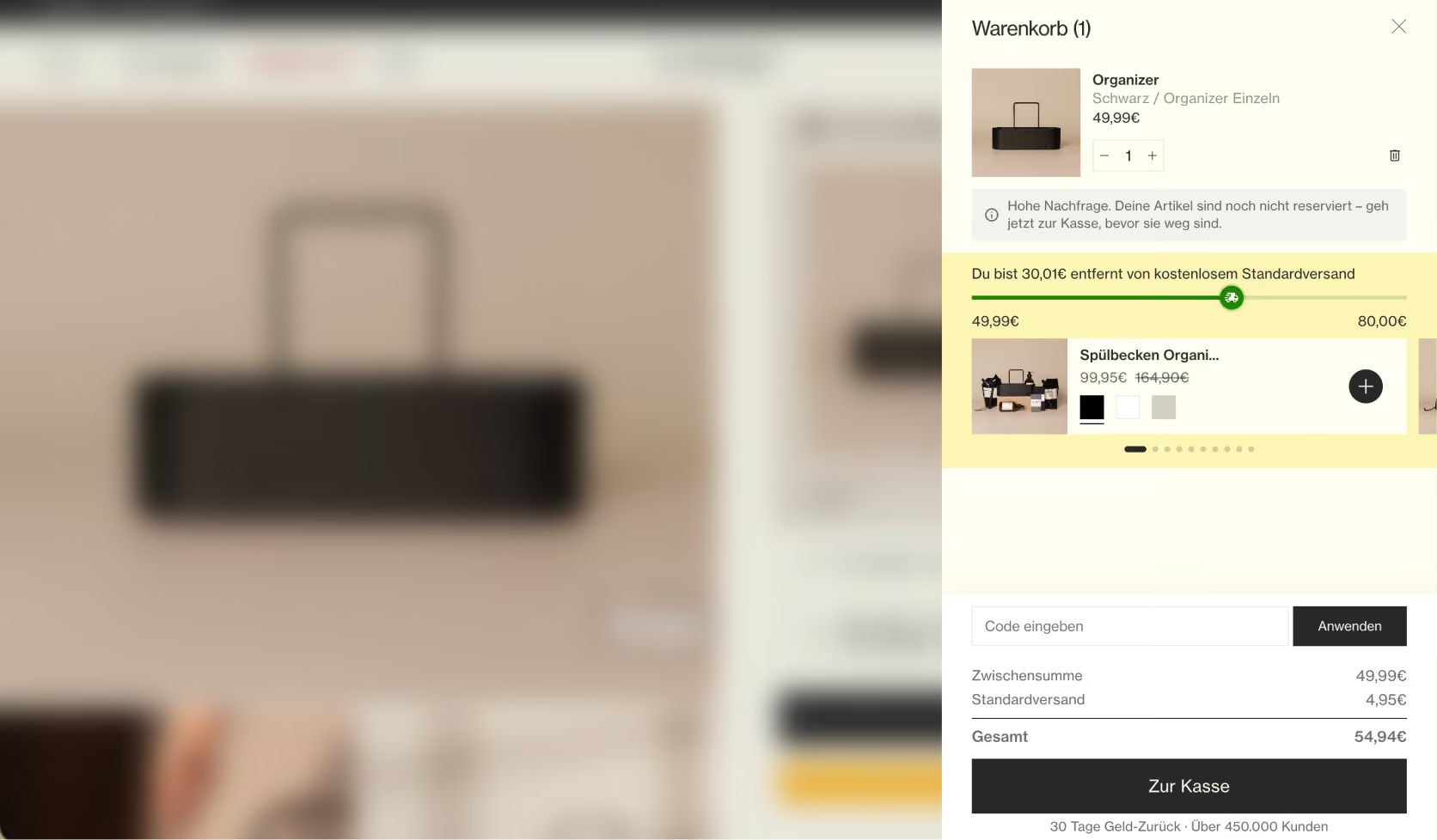
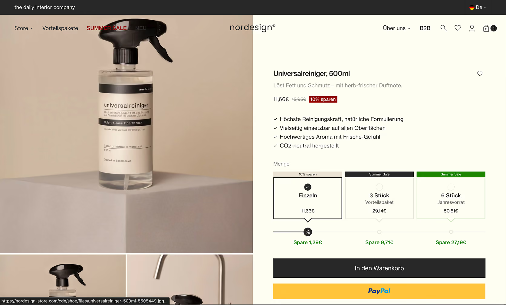
Fewer elements, more revenue per visitor
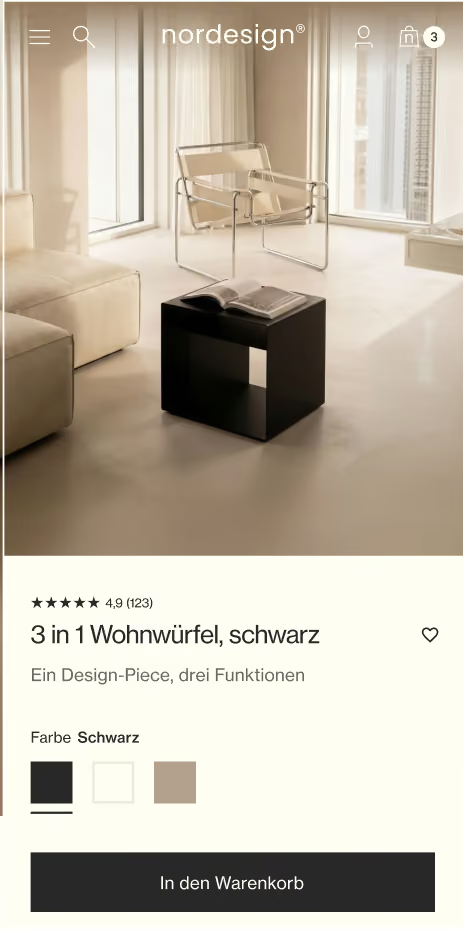
When you buy products from nordesign, you make your decision with your eyes. You need to be able to visualize the item in your own space, and to do that, you need high-quality photos—and, above all, one thing: space. That’s exactly what the section-based layout is designed to provide. Few elements per screen, generous white space, and sections that give the product the entire area to itself.

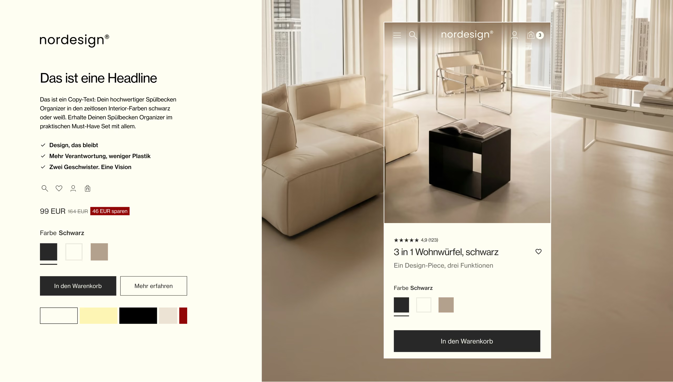
Flexibility of the website: Design for multi-device use
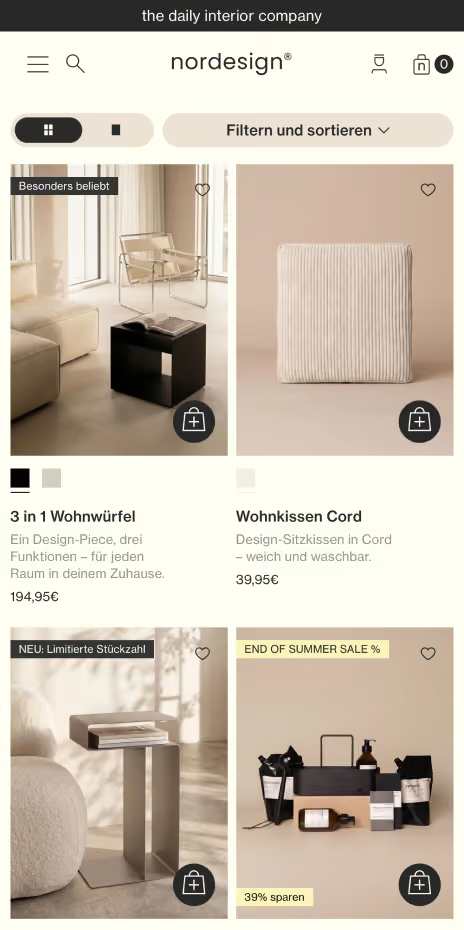
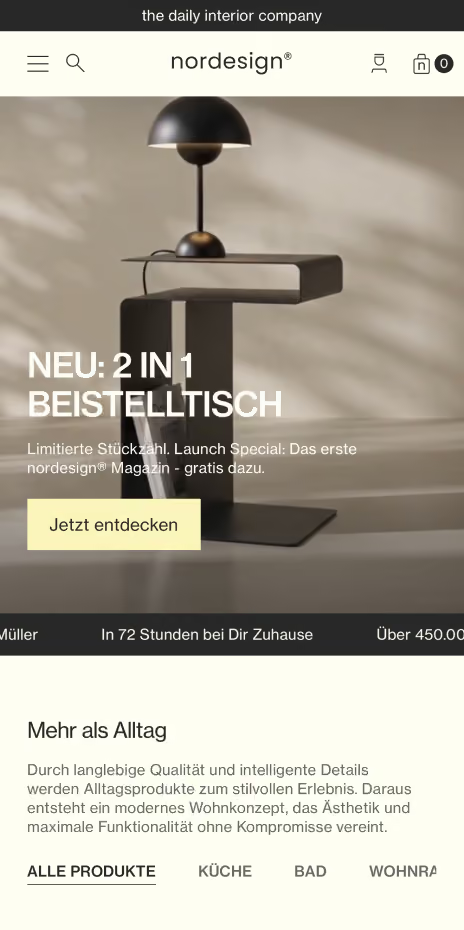
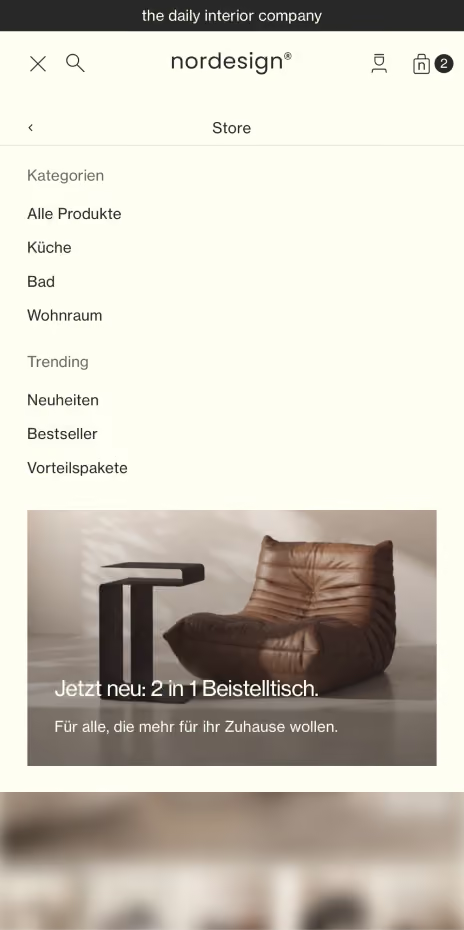
The main focus was on developing a mobile-optimized website, as the target group is predominantly on smartphones. This ensured a smooth and appealing user experience on mobile devices.
You want to know more?
Hey 👋 We look forward to hearing from you, then we can answer questions about the project.